Toronto Downtown West Branding
Toronto Downtown West BIA, Toronto
The Toronto Downtown West area serves as a vibrant hub for arts, culture, hospitality, sports, and business, encapsulating a distinctive urban experience known as the Toronto Entertainment District. Established in 2008, this district, extending west from Spadina Avenue to Bathurst Street, has undergone significant growth and transformation. In recognition of its expanding borders, the district underwent a rebranding, now referred to as Toronto Downtown West, aligning with its evolving identity and scope.
For over 14 years, KDA has been actively involved in developing the brand identities for both the original Toronto Entertainment District and the new Toronto Downtown West BIA. In each instance, KDA created a comprehensive brand platform encompassing website design, social media strategy, signage, stationery, banners, merchandise, as well as brand guidelines.

vibrant neighbourhood. vibrant brand.
Characterized by three leaf-like symbols distinctly representing the welcoming borders of the BIA, the Toronto Downtown West brand communicates the essence of growth and inclusion – core values of the BIA itself.
Whether in animation or portrayed in 2D or 3D formats, the brand maintains a simple yet strikingly bold presence that mirrors the kinetic energy and vitality of this vibrant neighbourhood.

Primary Colour Palette
Colour & Typography
The primary brand colours of the Downtown Toronto West BIA logo consist of an exciting palette of vibrant orange hues for the leaf-like symbols and a sophisticated grey for the wordmark. The typeface selected is Barlow, chosen for its visually strong balance with the leaf-like symbol of the logo.
Friendly and attractive, Poppins serves as the secondary typeface—a solid mix of sophistication and function.
Colour and typography are strong extensions of a brand personality, and they play a major role in creating a consistent look across all communication platforms. By carefully selecting vibrant orange hues, sophisticated grey tones, and complementary typefaces, the Downtown Toronto West BIA logo ensures a cohesive and memorable brand identity that resonates with its audience.


GRAPHIC PATTERN SERIES
Designed and inspired to complement the brand logo, a series of graphic patterns have been developed that utilize thematic colour palettes to represent distinct areas and characteristics of the BIA.
These patterns and colours are showcased within the leaf-like symbols of the BIA’s logo, enabling versatile usage across various platforms.
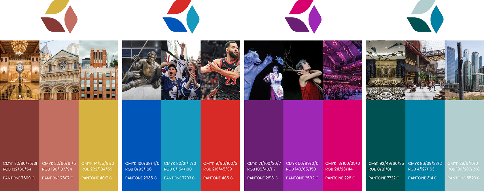
Thematic Colour Palette


KDA’s breadth of experience, coupled with their brilliant creativity, made managing expectations a seamless process.


Distinctive
Area Banners


