Aurora Parks & Trails Branding
TOWN OF AURORA, AURORA
Aurora Parks & Trails boasts over 45 parks with lush greenery, playgrounds, and sports facilities, along with an extensive trail network for hiking, cycling, and wildlife observation, fostering a connection with nature amidst urban life.
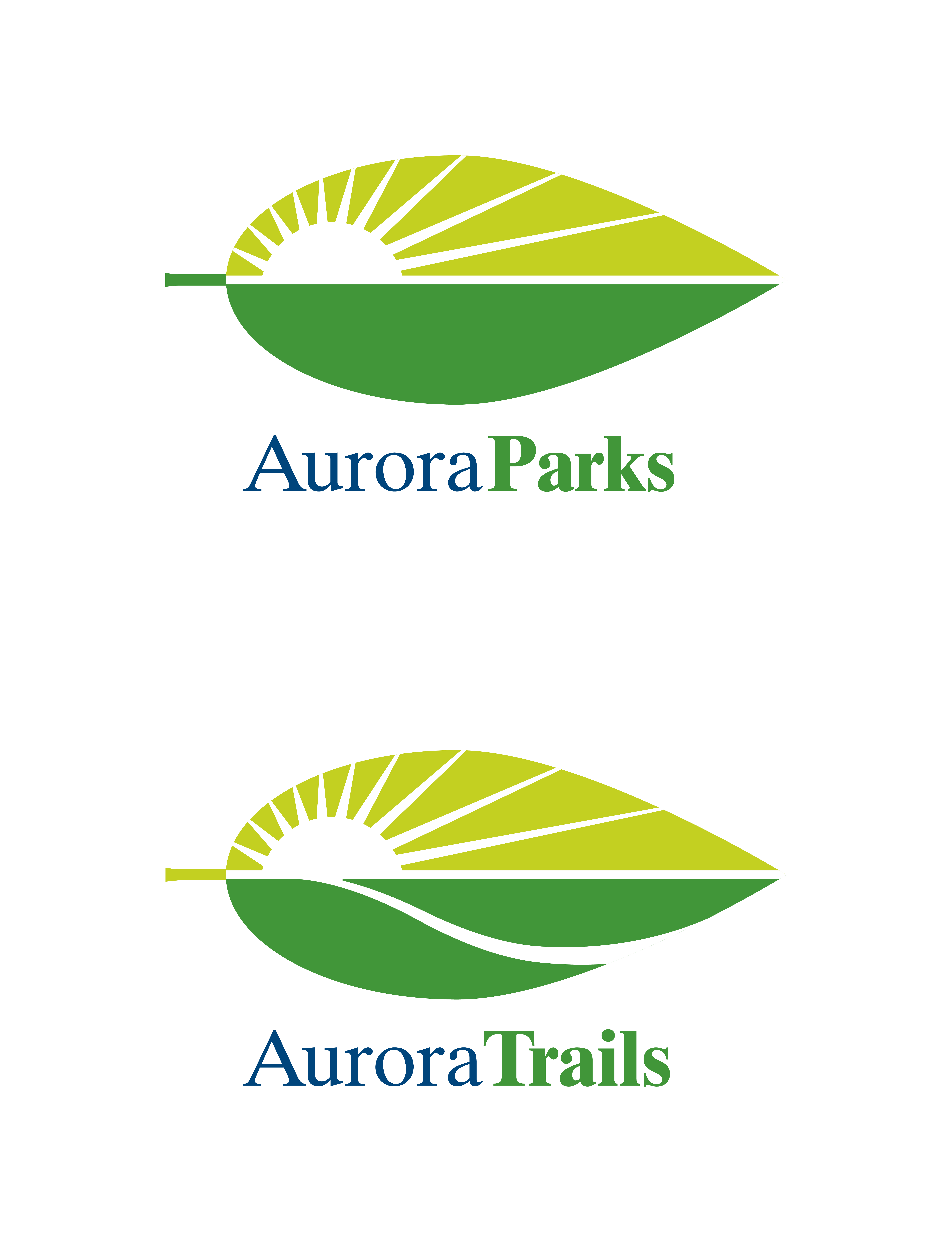
KDA has designed two complementary brand logos for Aurora Parks & Aurora Trails, ensuring instant recognition and identification. Both logos feature a leaf-form and a rising sun, symbolizing Aurora’s natural beauty and vitality. The rays of light represent Aurora’s vibrant energy while also echoing the veining within a leaf, underscoring the harmony between the city and its environment.
To distinguish the Aurora Trails logo from the Aurora Parks logo, a graphically depicted trail meanders and leads toward the rising sun. This trail graphic has been custom-designed with nuance, maintaining the representation of the leaf’s veining while guiding the viewer’s eye towards the sun, symbolizing exploration and the journey through Aurora’s scenic trails.

COMPLEMENTARY COLOUR PALETTE
The consistent use of colour for both logos is an important element to maintain, as it coordinates with the overall colour palette of the newly designed wayfinding system and integrates with Aurora’s own brand colour.
A simple, succinct name presentation of ‘Aurora Parks’ and ‘Aurora Trails’ provides excellent legibility for signage, print and web and social media communication.
With a simple and versatile form, the branding is suitable for both large and small reproduction sizes.

INDIGENOUS WILDFLOWER ICONS
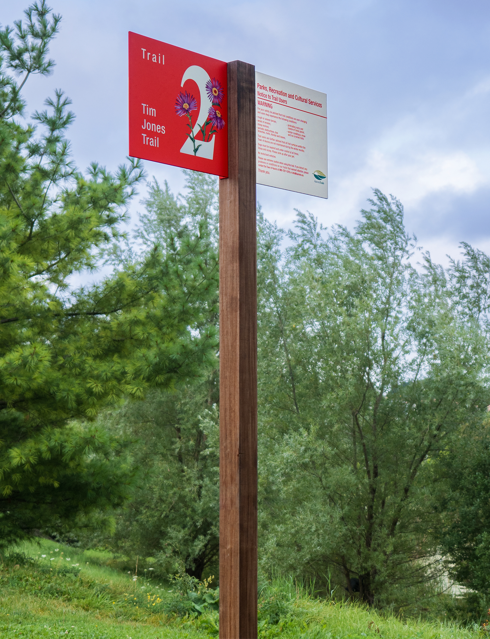
In addition to the two brand logos, KDA also developed a comprehensive signage and wayfinding program for Aurora Parks & Trails. A unique aspect of this program is the colour-coded trail identification, employing various indigenous Ontario wildflowers as icon markers. These flowers reinforce the colour system and serve as additional landmarking tools, aiding visitors in remembering locations, distinguishing between trails, and learning more about Ontario wildflowers within the park systems.


KDA’s thoughtful design approach ensures that both logos capture the essence of Aurora Parks & Trails, embodying the city’s commitment to outdoor recreation, natural preservation, and community engagement.


INTERPRETING WILDFLOWERS
To enrich the wayfinding experience throughout Aurora’s parks and trails, KDA integrated a series of interpretive panels within the signage, educating users about the significance and beauty of the wildflower icons as they navigate the landscape.

DISTINCTIVE PICTOGRAMS
Capitalizing on the many activities to be enjoyed, KDA created a series of bespoke pictograms designed to evoke a sense of fun and enjoyment, while the simple, clean lines of the pictograms make them user-friendly and easy to interpret.

Trail
Blazing


COORDINATED BRAND LOGOS
Strong coordination is achieved with the Town of Aurora brand through colour, form and symbolic content while providing a distinctive identity unique to Aurora’s Parks and Trails.

